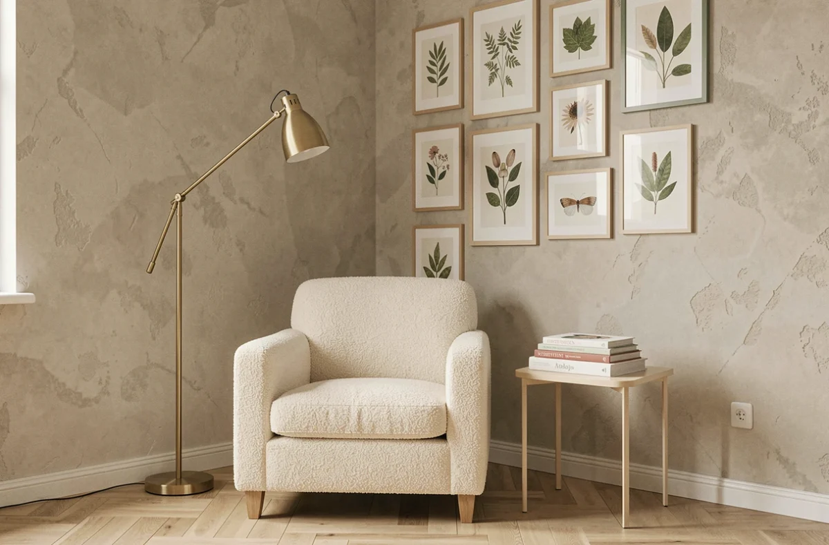
A sofa that clashes with the wall, a light fixture too small for the room, a rug floating in the middle of the living area: we’ve all experienced that moment when the decor just doesn’t work, without understanding why. Transforming your interior with unique and trendy decor doesn’t rely on accumulating objects, but on a few technical choices that change the perception of a space.
Health Labeling of Interior Decoration Materials
Before choosing a paint or wall covering for its color, it’s beneficial to turn the can around. In France, construction and decoration products must display a volatile organic compound emission class, rated from A+ (very low emissions) to C (high emissions). This regulation has been in effect since September 1, 2013.
This criterion applies to paints, adhesives, laminate flooring, and soft floor coverings. You can find furniture pieces and decorative accessories at reves-de-deco.fr, but the reflex to check the health label remains valid for anything related to finishes installed in the home.
In practical terms, a wall repainted with paint rated C in a poorly ventilated bedroom degrades air quality for several weeks. Systematically favoring A+ class on the most exposed surfaces (bedrooms, closed living spaces) serves as a selection filter as structuring as the choice of color.
Upholstery Fabrics and Composition: The Trap of Stain Treatments
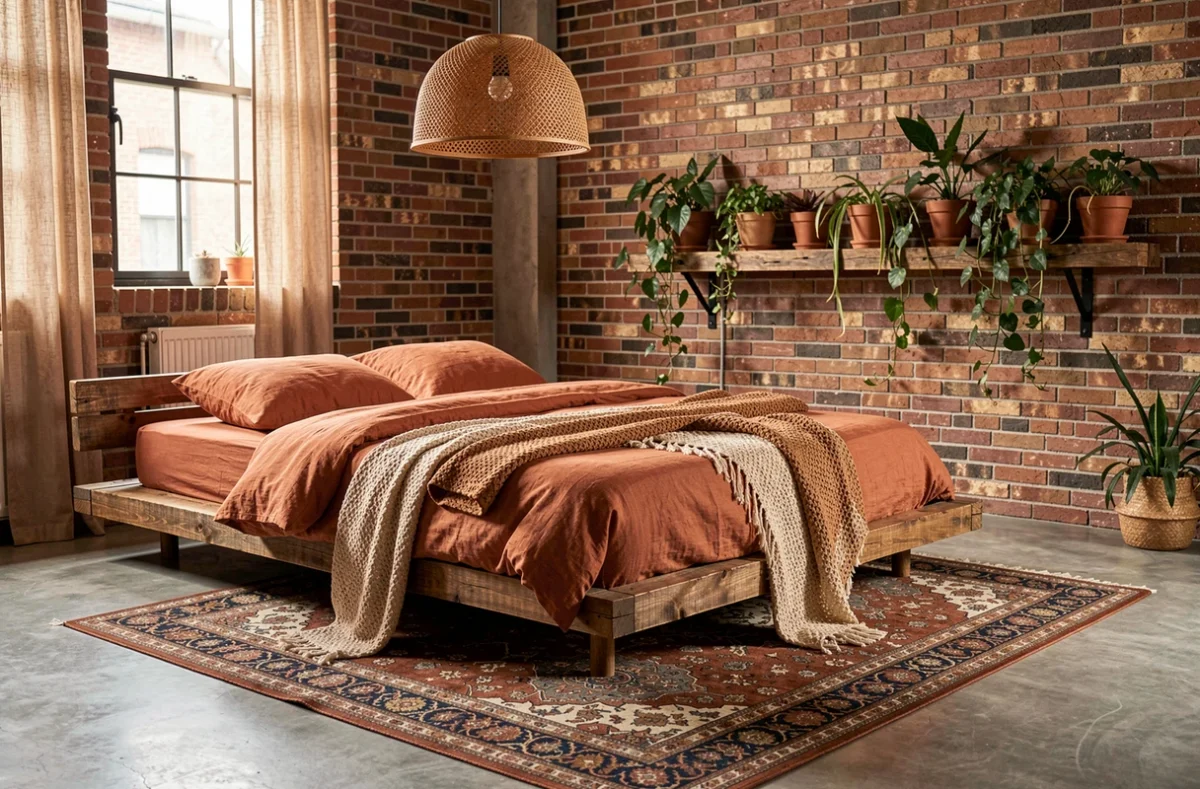
Curtains, cushions, rugs, sofa covers: textiles represent the easiest layer to renew in an interior. They are changed with the seasons or moods, making them a very accessible decorating lever.
The point of caution concerns waterproofing and stain treatments. Some use PFAS, persistent chemical substances. The French law of February 27, 2025 now regulates products containing these compounds. For a curtain or upholstery fabric, requesting the composition sheet from the seller allows you to verify the absence of PFAS treatments.
In practice, textiles made from raw linen, untreated cotton, or wool without special finishing offer textures that contribute to a warm ambiance without raising this question. The choice of untreated natural textiles aligns here with style as well as health precaution.
Trendy Decor with Second-Hand Furniture: What to Really Check
Finding a 1960s buffet or reclaiming a farmhouse table adds a character that no standardized new furniture can replicate. Second-hand has become a style in its own right, not just an economic choice.
A common mistake is to rely solely on the appearance of the furniture. When considering an antique piece, three things should be checked before integrating it into a decor project:
- The condition of the joints: a sticking drawer or a wobbly leg often indicates a deeper structural problem than a simple adjustment
- The nature of the panel: solid wood furniture ages well, while a particle board panel swollen by moisture cannot be restored
- Signs of deformation: a warped tabletop or a detached back indicate storage in a damp place, compromising durability
A well-inspected second-hand piece can last as long as new furniture, provided you don’t get seduced solely by the patina. Turned wooden table legs or original brass handles add a design touch that industrial reproductions struggle to match.
Colors and Proportions: Calibrating the Relationship Between Walls and Furniture
It is often said that one must “dare to use color.” The advice remains vague until you define where to place it and on what surface. A whole wall painted terracotta in a twelve-square-meter living room overwhelms the space. The same terracotta applied to the back wall of a hallway visually elongates the space.
The operational rule lies in the ratio between the colored surface and the size of the furniture against it. An accent wall works when the furniture placed in front is lighter or more neutral. Two heavy visual masses (saturated wall + imposing dark furniture) neutralize each other instead of enhancing one another.
The Role of Materials in Color Perception
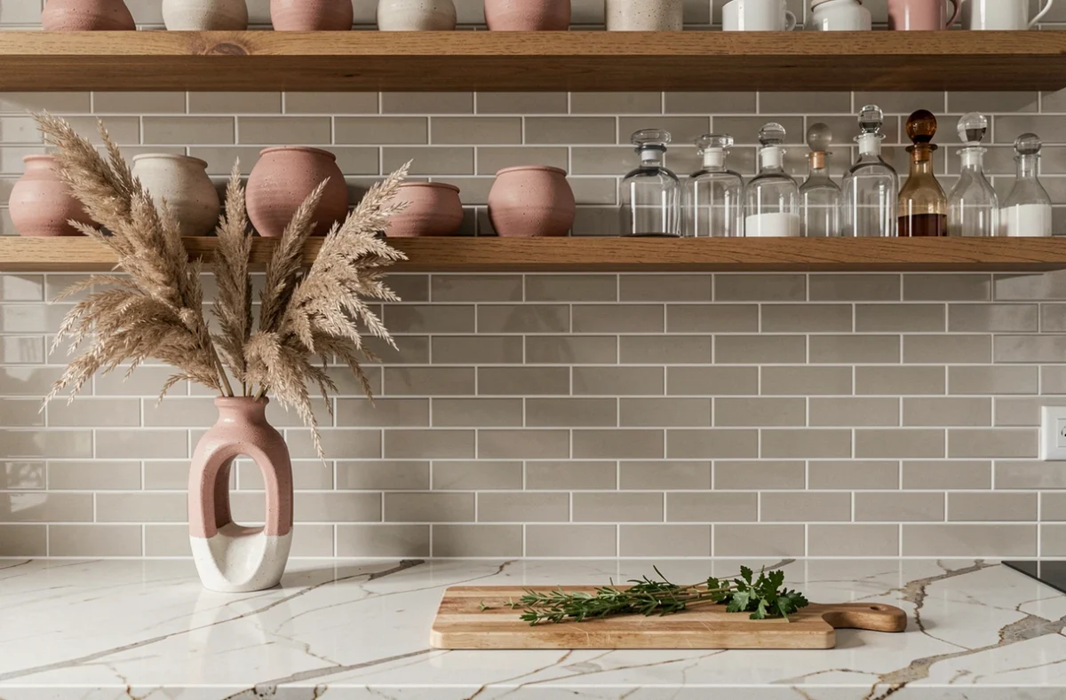
A sage green on a matte wall does not produce the same effect as the same green on glossy tiles. Matte absorbs light and softens the hue, while glossy reflects and intensifies it. When choosing a trendy color to transform a space, first test the rendering on the actual finish of the support (matte, satin, lacquered) rather than on a paper color chart.
Light woods (bleached oak, ash) amplify the pastel shades placed nearby. Dark woods (walnut, smoked oak) create a more pronounced contrast that suits neutral walls or off-whites. This interplay between wall color and wood essence of the furniture forms the foundation of a coherent interior, even before considering accessories.
Decorative Lighting: Layering Sources Rather Than Choosing Just One
A central ceiling light provides illumination but does not decorate. The current trend in interior design relies on the layering of three levels of light: general diffuse lighting, accent lamps that create zones, and decorative light points (string lights, candles, discreet neon).
Practically, start by identifying the activity zones in the room. A reading nook requires an adjustable lamp at shoulder height. A dining area benefits from a low pendant that visually tightens the group around the table. Underused corners come to life with a simple floor lamp.
The result does not depend on the budget. Replacing a single ceiling light with two or three well-positioned sources transforms the atmosphere of a room more radically than changing furniture. It is often the first lever to pull when wanting to refresh decor without a complete overhaul.
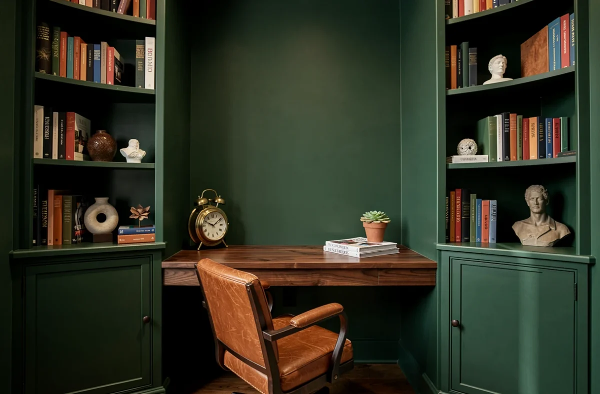
Transforming an interior is less about the amount spent than the precision of choices. Checking a paint label, inspecting a second-hand piece, testing a color on the right support, shifting a lamp by thirty centimeters: these modest actions yield visible results from day one.